The Problem

Technicians relied on a worklist to manage up to 50 active jobs, but it was unclear whether the existing card-based layout supported efficient scanning and decision-making.

At the same time, introducing a table-based solution would require new components and added engineering complexity.

The team needed to determine whether a new pattern was necessary or if the current system could be improved to meet user needs.

My Contributions

  • Designed and led a comparative usability study with 10 field technicians
  • Defined tasks, success metrics, and evaluation criteria across both layouts
  • Synthesized quantitative performance data and qualitative behavioral insights
  • Identified key usability risks (scanning, scrolling, information hierarchy)
  • Delivered clear, actionable recommendations to product, design, and engineering

Progression

Framing the Decision
No items found.

Atlas needed to decide whether to introduce a table-based worklist or improve the existing card system.

Technicians manage up to 50 jobs at a time, requiring fast scanning and prioritization.

The challenge was balancing user needs with system constraints and engineering effort.

‍

What We Learned
No items found.

Both layouts performed nearly the same in testing.

  • Card: 78% success
  • Table: 81% success

The difference was negligible—but user behavior told a clearer story.

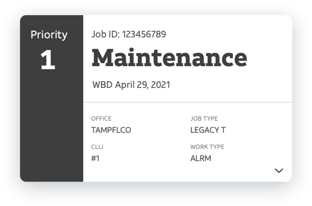
Cards were easier to scan than expected
Technicians relied on quickly identifying key information.

Horizontal scrolling was a consistent pain point
Most users avoided it entirely.

Bulk actions weren’t the issue—information was
Users needed key details before taking action.
‍

Recommendation and Impact
No items found.

We recommended continuing with the card-based worklist.

Not because it “won” in performance—but because it aligned better with user behavior and system constraints.

  • Comparable performance
  • Stronger scanning experience
  • No horizontal scrolling
  • Lower engineering cost

Instead of rebuilding, we focused on improving:

  • Prioritize address and circuit information
  • Remove redundant fields
  • Improve interaction clarity

Conclusion

This study helped the team make a clear, evidence-based decision without introducing unnecessary complexity.

Rather than building a new table component, we validated that the existing card system could meet user needs with targeted improvements.

The result was a more focused design direction, prioritizing information clarity and usability over rebuilding patterns that didn’t meaningfully improve performance.

Full Presentation upon Request

‍